Recently I've been thinking a lot about how someone develops taste. It's all over social media right now, and I think it's one of the things we, as engineers and designers, can still bring to the work to set ourselves apart from AI.
There are guides for this. A lot of them stay on shadows, a model, a clean minimal UI, or how large an element should be inside a widget. Taste has more nuance than that. It's highly subjective, and it's a skill. The skill is understanding what you can contribute to a product, while keeping it usable, and while the work still feels like yours.
Shipping code has become easy, so companies are pushing to release a lot of it quickly. That creates anxiety for creative people. Not because they've gotten lazy. Because the pressure is up, and there's very little time left to think. Work used to move slower, and that left time outside the job to draw inspiration from. At this pace, building taste, and spending time with good design and art, matters more for anyone in a creative field.
I expect the workload and the anxiety to keep growing, especially for designers. I've felt it. I spent several months thinking about it while I was working, and I have a few ideas I want to follow over the next few years so the work stays human and feels fresh. If I use AI, what I hand over and what I do myself should be intentional. The result should feel creative, and it should solve the customer's problem. That is still the job.

Start from a niche you actually care about. You don't need to force one because everyone else has one. You also don't need to be a graphic designer or a photographer. A genre of music you love is already a kind of taste. The useful question is how that interest can show up in the work.
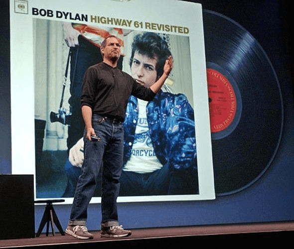
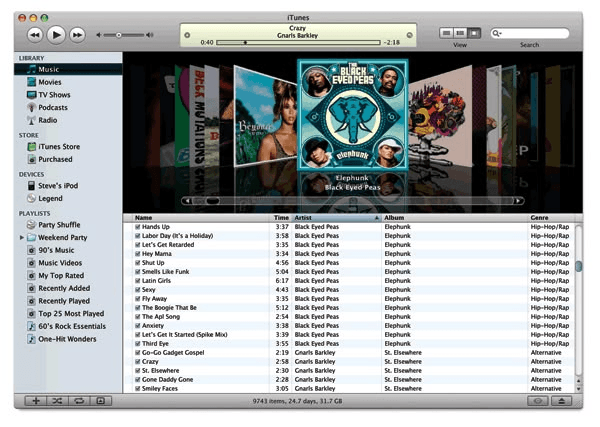
Steve Jobs had excellent taste in music, and he brought it into Apple's products and the advertising. When Apple promoted Apple Music, the demos used carefully chosen tracks. The music was part of the presentation, and it changed how the product felt.
You see a similar thing with photography, design, and film. Even a simple object, a toaster or a coffee machine, can have ads that feel cinematic. Companies hire music composers and film directors for this. It isn't strictly necessary. It becomes part of the branding anyway.
You can practice the same attention. Watch films. Watch Disney, or other animation, and notice the motion, the micro-interactions, the small behaviors that feel human. The Grok bot uses eye expressions to feel more lifelike. That kind of detail can apply in any domain.
I draw a lot of inspiration from music. I also keep mood boards, Pinterest collections of shoes, watches, and brands.
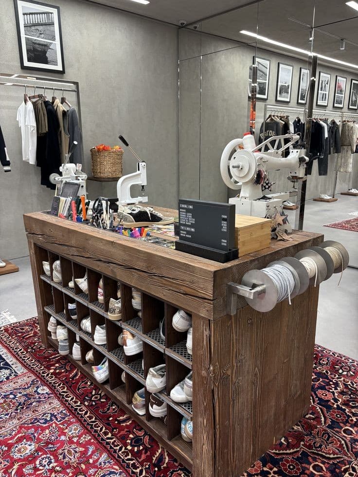
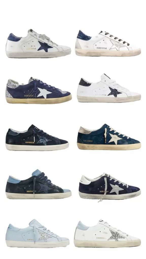
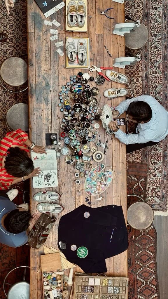
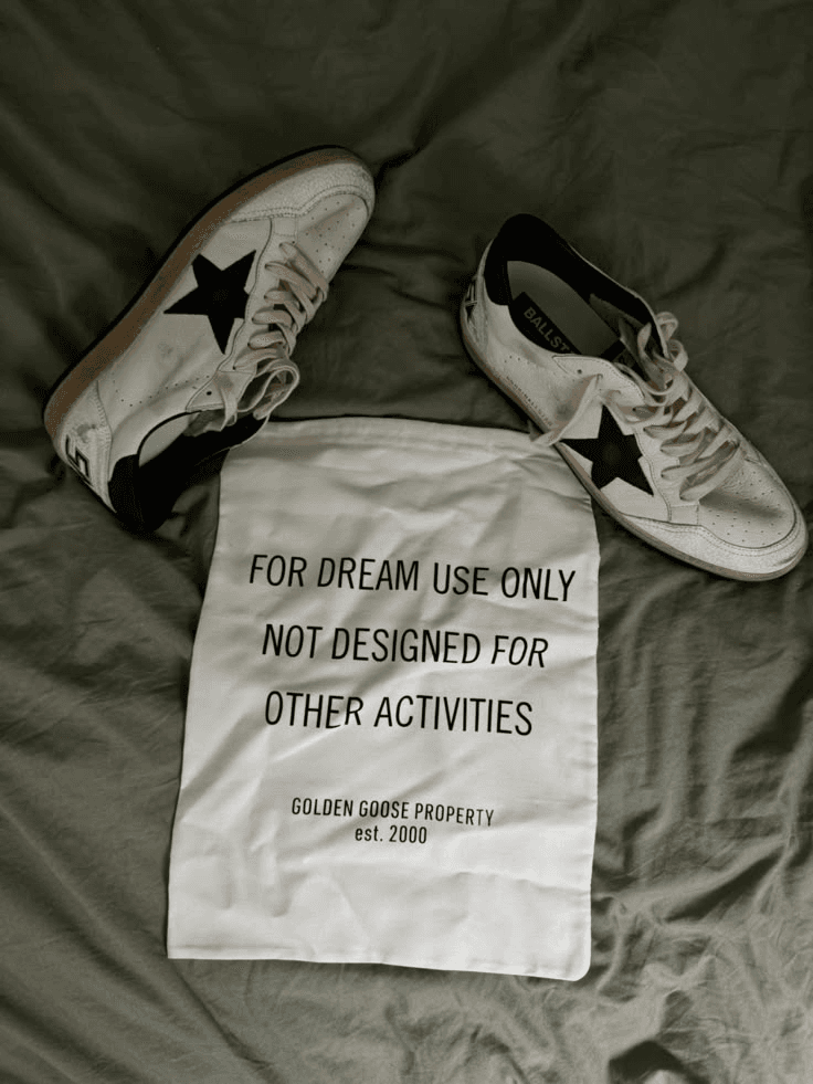
I love Golden Goose. I like the vibe they've built: an old-Italian leather look, worn on purpose. The products look dirty and rugged, as if they've been used hard, and they're brand new. The more you wear them, the better they look. That's a core part of the brand.
The shoes themselves are relatively simple. Basic leather and stitching. The identity is the hand work. Details are hand-stitched. The leather is cut in the store, and each pair is assembled by hand, even though the raw materials are machine-produced.
If you buy something in the store, there's a vanilla gourmand scent on it. It lasts. I have a pair of Golden Goose jeans I've owned for four months. After several washes, the scent is still there. The dust bag is just as direct. For dream use only. The brand is niche, and it isn't marketed heavily. People who know it keep buying, because they are so clear about the handcrafting and the deliberately worn, torn look. I find that inspiring.
Another thing I want to keep working on is making products feel more natural.
Onboarding is a big part of it. Imagine walking into a store to buy a high-end watch. The way the sales associate treats you matters.
Are they willing to share a direct way to reach them, so the next visit goes through that same person?
A demo can do some of this too. Give people a version they can actually use, with a day that looks like theirs. Then make it fast, and a little playful.
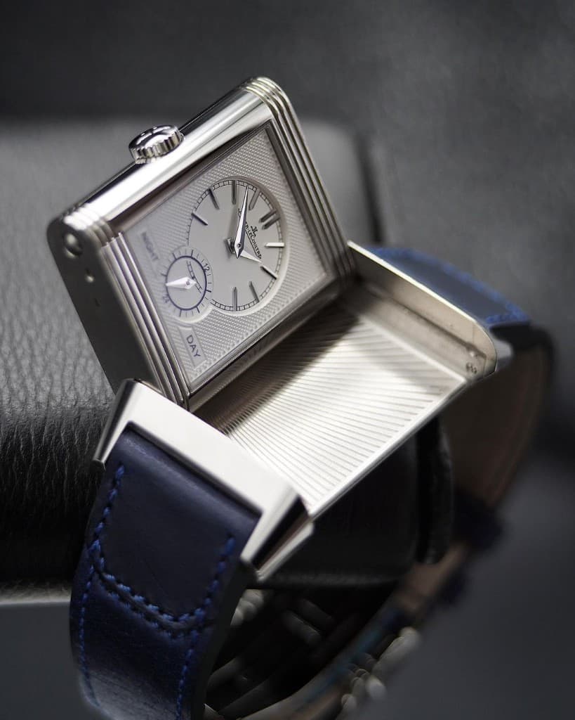
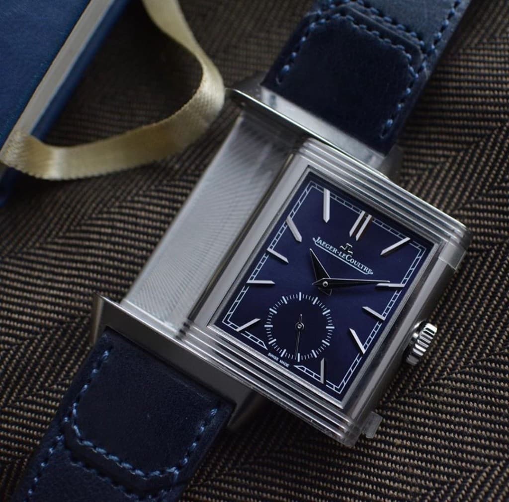
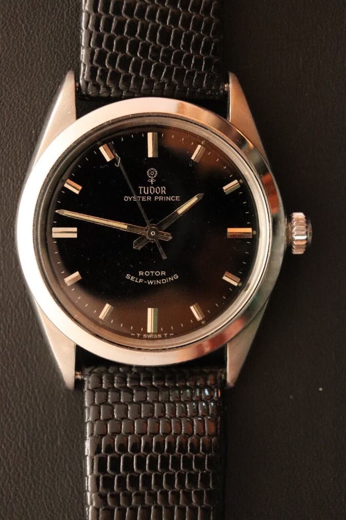
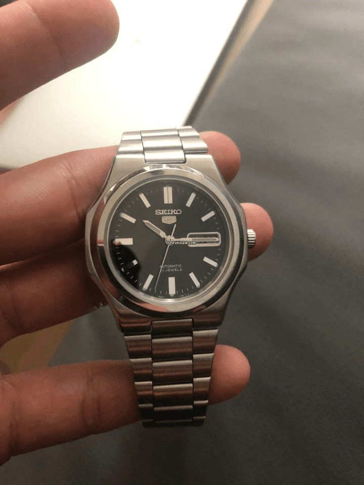
I keep looking at the dial. A Reverso, a Tudor, a Seiko. The thickness of the numbers, Roman numerals or plain indices, and how much space sits around them.
And the room around the object. Does it intimidate you, or leave you better than you came in? Even if you can't buy it right now, you should leave wanting to come back.
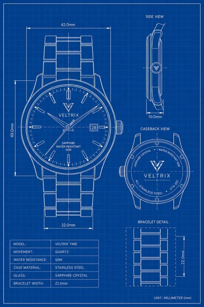
The drawing shows the same care. Case size, thickness, bracelet width. You can read the object before it is on a wrist.
Some products are intimidating. Rolex won't push a high-end watch until they know whether it's your first. That conversation is part of the branding. I don't prefer that approach.
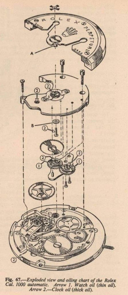
What I do like is the engineering, shown in pieces. Gears, screws, a thin dial and a thick dial. The brand is already known, which is why it needs so little marketing.
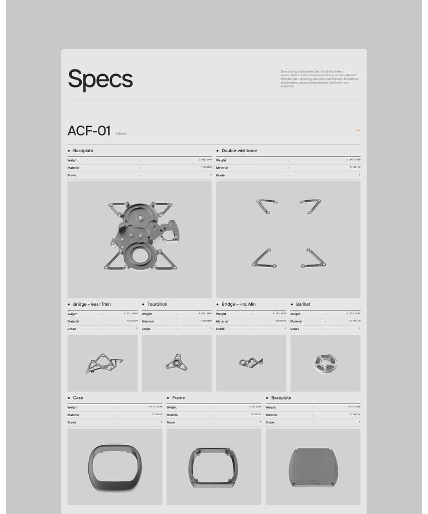
Omega, Jaeger-LeCoultre, and brands in that range put the weight on the parts. Material, grade, each piece on its own.
I especially like the Reverso from JLC. At a store in Mumbai, I wasn't there to buy anything. The person talked with me anyway, and I left with a strong impression of the brand.
These are the things you decide, and then work hard to carry out. It's a collaborative effort.
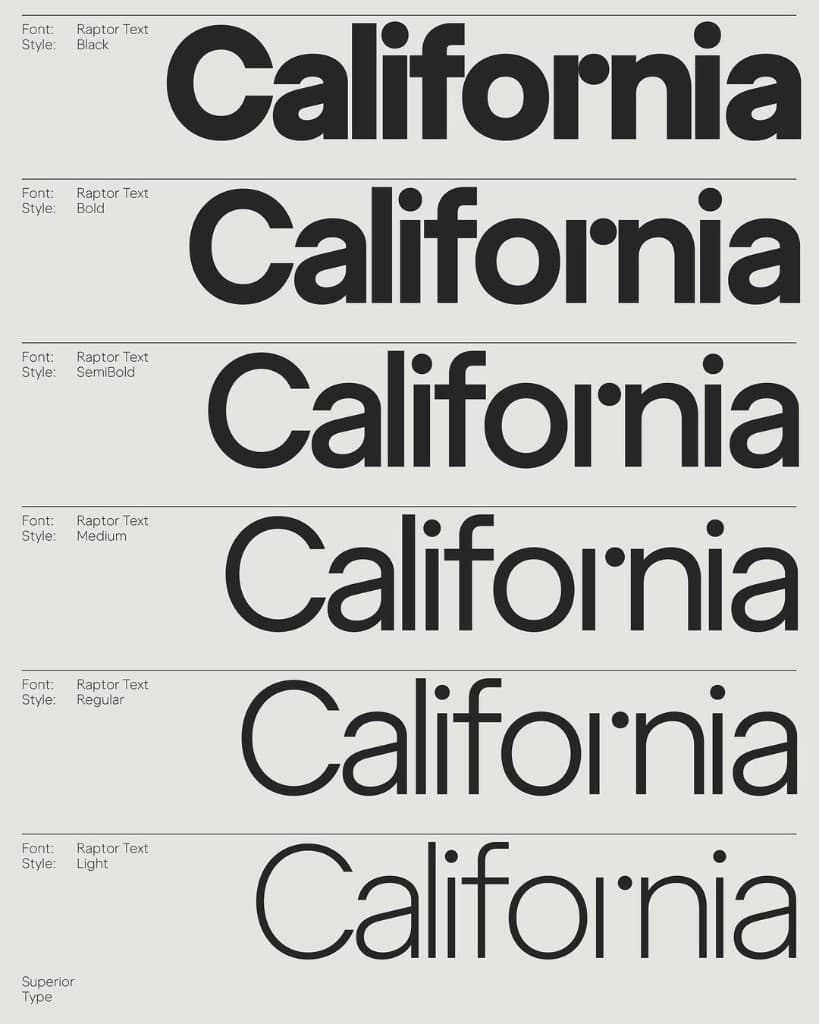
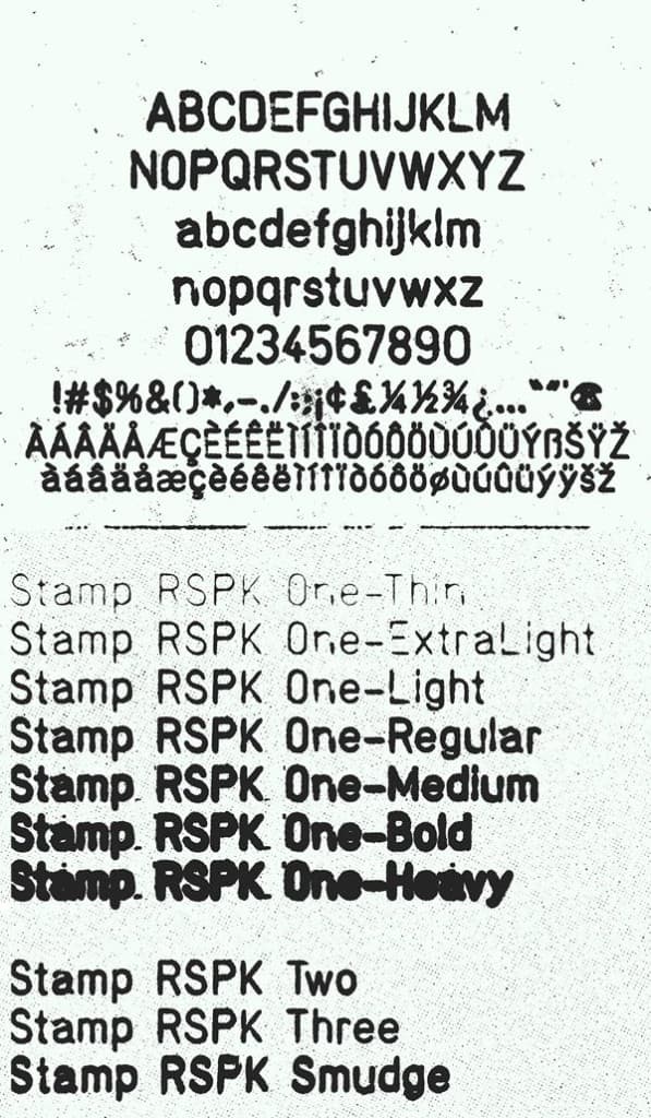
Away from the dial, I spend the same kind of time on type. The weight, from a thin stamp to a heavy grotesque.
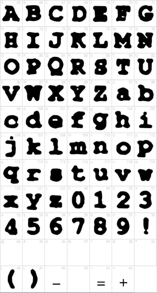
Some letters are almost soft. Thick, uneven, more drawing than a system. You feel the weight before you read the word.
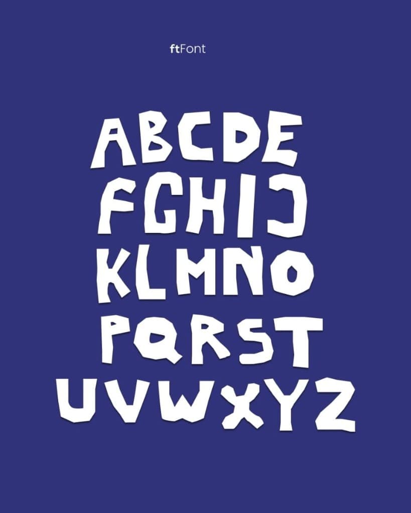
Then the spacing becomes the idea. Uneven heights, cut edges, one flat color behind them.
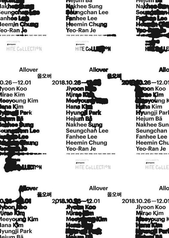
How much copy they use, and the specific words they choose. Names and dates can stack until the type is the picture.
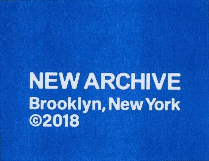
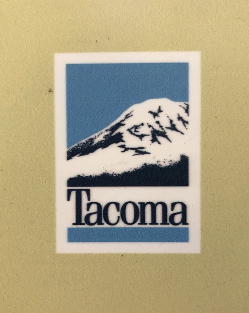
Sometimes the whole vibe is a few words on cloth, or a mountain and a place name.
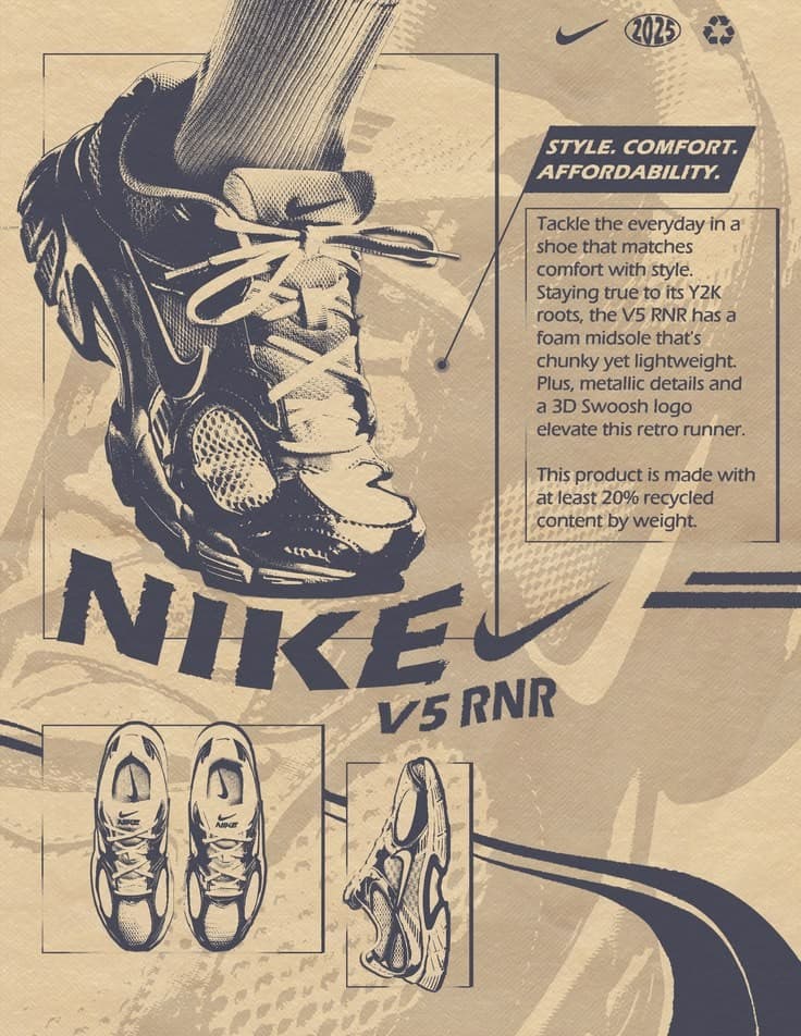
Nike goes the other direction. The graphics are sporty and specific. A shoe, a short story, a feeling built around the product.
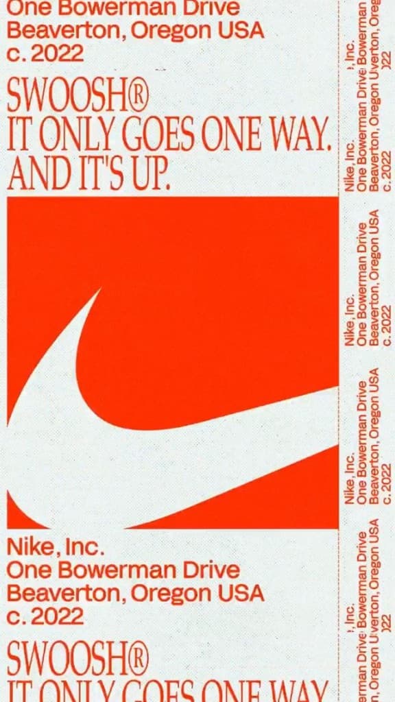
Sometimes the mark is the whole layout. One shape, one sentence. Loud, and simple.
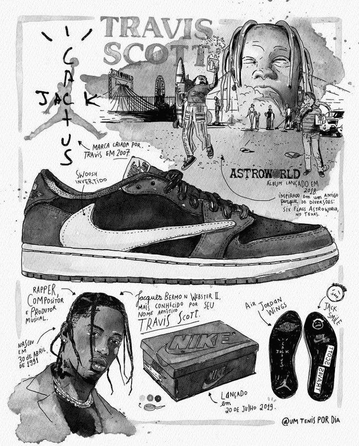
The same shoe can carry a person. A drawing, a name, a story written around the product.
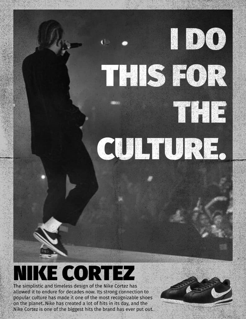
Or it is culture, said outright. A stage, a line of type, the shoe at the bottom. The brand invests in sport, and in the people who wear it.
Either way, the product still has to be high quality. The vibe is what you build around that.
As more of the code and the stable features get shaped with AI, these are the choices that keep a product from feeling like anyone could have shipped it.
A lot of the marketing is falling to designers now, too. Design engineers already have the tools for it, screen recorders and utilities that generate video from code, and they know what is worth showing a customer.
The person closest to the work can often make the more useful material.
Design follows the same principles. The product should feel snappy. Loading should be quick.
If you have an AI chat, the choreography should be clear and simple. It shouldn't feel like the model is wandering.
Study how luxury brands treat someone in a physical store, and apply that to the digital product. Look at how other designers build an experience. As you learn, put your own DNA into the work.